Build trust in your design system with Visual Regression Testing
Edit: This article has also been published on the Spendesk blog: https://engineering.spendesk.com/posts/build-trust-with-visual-regression-testing/
At Spendesk, our frontend is fully built around a design system called Grapes. However, this wasn’t always the case, and a big part of my job involved growing the adoption of our design system within the frontend. To achieve this, we needed our developers to trust our design system. This means, ensuring reliability and stability, no one wants to work with a library that’s not working properly.
Prior to any initiative, we invested significant time and effort into adding relevant unit tests to prevent issues and regressions between each new release.
However, while our developers were confident in the features of our components, we received many questions about their visual appearance, especially following a new release. These feedback highlighted the need for a different kind of testing which led us to introduce Visual Regression Testing.
Storybook
Storybook is a frontend workshop for building UI components and pages in isolation. Thousands of teams use it for UI development, testing, and documentation. It’s open source and free.
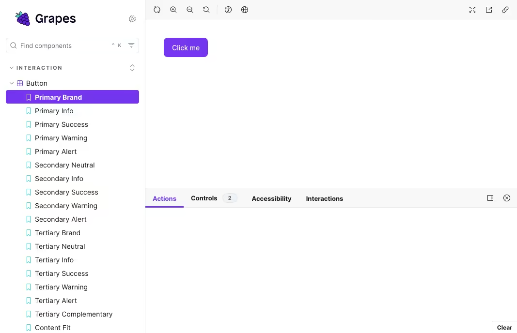
 Our Storybook with a story about the Primary button
We use Storybook to build and test our Design System. It serves also as a source of truth for developers and designers. For every pull request, a Storybook is built in order for developers to preview the component and designers to QA the design. So ideally, we would want a tool that take this Storybook and make visual regression testing on it.
Chromatic
Chromatic is a visual testing tool developed by the same team as Storybook. As a result, the integration process was extremely straightforward, and we only needed to make minor changes to our CI.
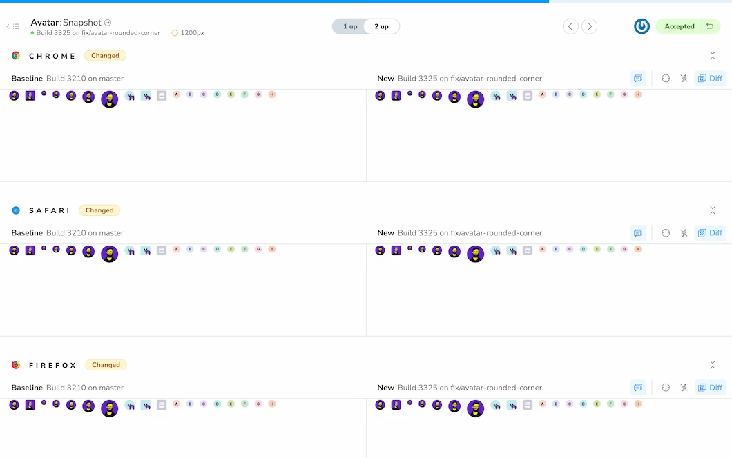
During the build process, we upload the storybook to their servers, they take screenshots of our stories, and we get a feedback that shows us the differences (if any) the new build has against our main branch.
 An example of feedback by Chromatic
We started with the free plan to test the product. The free plan includes 5000 screenshots which were enough to cover our most used components:
- Button
- Callout
- Inputs
- Tags
Because we were very satisfied by the product, we moved to the standard plan for two main reason:
- We aimed to cover all our components, meaning we had to increase the quota of screenshot
- We wanted to test our design system against multiple browsers: safari, firefox and chrome.
A Snapshot story for visual regression testing
As our design system grew, Chromatic’s quota limit became a problem and we needed a strategy to avoid reaching the quota.
At the beginning of 2023, we came accros this case study from Netlify on how they use chromatic: Netlify case story.
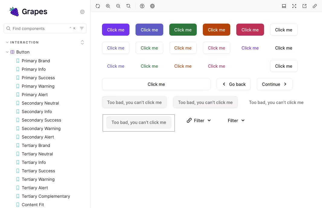
Their approach involved disabling Chromatic for all stories in the Storybook, except for one ‘special’ story. This special story would then contain every variant and state (let’s say previous stories) of a specific component.
For example, if you have 10 variants of a button and 10 corresponding stories, you would consolidate them into a single story and make a screenshot of that one story instead of taking 10 separate screenshots.
 The Snapshot story which includes all variants of our buttons
This approach can significantly reduce the number of screenshots taken, which is why we decided to implement it.
We started to disable Chromatic screenshot globally using the parameter disableSnapshot.
// .storybook/preview.tsx

const preview: Preview = {
  parameters: {
    chromatic: {
      // Disable screenshot for every story
      disableSnapshot: true,
    },
  },
  // ... other parameters
};

export default preview;
We then created a component called SnapshotContainer. This component would render as many stories as given in the props stories.
We used the utility function composeStories to build SnapshotContainer.
Finally, at the end of each stories file, we use this component to build our Snapshot story:
// Many stories about the Callout component

export const Snapshot: Story = {
  parameters: {
    chromatic: {
      // Enable screenshot for this story
      disableSnapshot: false,
    },
  },
  render: () => (
    <SnapshotContainer
      stories={[Alert, Info, Success, Warning, WithContent, WithSpecificIcon]}
      meta={meta}
    />
  ),
};
Doing so, we reduced from more than 500 screenshots to less than 80 with the same level of confidence.
One issue with this solution is that it doesn’t work with interactive stories. In some cases, user interaction is required before a screenshot can be taken, such as selecting an option from a dropdown menu. For these types of stories, we kept the traditional approach of taking a screenshot per story.
Conclusion
Implementing visual regression testing within our design system was essential to its success at Spendesk. I truly believe it saved us hundreds of hours spent debugging some unfortunate CSS issues, responding too many Slack threads or just making visual QA. This time saved allowed us to focus on building high-quality components and supporting teams.
Today our design system fully powered the frontend of Spendesk with almost no issues1 in terms of both function and appearance.
Footnotes
-
We still have bugs time to time but without them, life would be rather dull. ↩