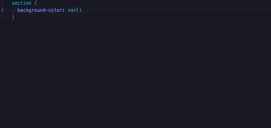
Design token autocompletion in VSCode
In December 2024, we released the first beta of the refreshed version of our Design System called Grapes at Spendesk.
This new version shifted from simple CSS variables to primitive and semantic CSS design tokens.
As part of our efforts to help frontend engineers get up to speed on this new version, we created a VSCode extension. This extension provided autocompletion when writing CSS, making the transition to the new design token system easier for the development team.
Context
Our design system used to have design tokens like this:
:root {
  --color-primary-lightest: #f4effc;
  --color-primary-lighter: #dfd3f6;
  --color-primary-light: #7542d9;
  --color-primary: #5d21d2;
  --color-primary-dark: #4719a6;
}
Previously, a design token was a simple representation of a color, spacing, or typography size. These design tokens were then used throughout the Spendesk frontend and our design system components.
The new version of our design system introduced the following architecture:
:root {
  --color-background-primary-default: var(--color-white-100);
  --color-background-primary-hover: var(--color-carbon-10);
  --color-background-primary-pressed: var(--color-carbon-15);
  --color-background-primary-selected: var(--color-purple-10);
  --color-background-primary-disabled: var(--color-carbon-5);

  --color-border-default: var(--color-carbon-15);
}
In the new version of our design system, the design tokens exposed are now linked to another set of design tokens called “primitives”. This is a big change from the previous approach.
Now, a single “primitive token”, such as carbon-15, can be used in different contexts, for example, for both the primary-hover and border-default design tokens.
This allows for more consistency and flexibility in how design tokens are applied throughout the system.
While documentation about this change was provided, we found good to provide a VSCode extension for our frontend engineers. This extension provides autocompletion for our design tokens directly within the IDE, making it easier for developers to work with the new token architecture.
Build a VSCode extension
Build a VSCode is rather simple.
Here is the core code of our VS Code extension (with some design token details omitted for brevity):
const borders: CompleteItem[] = [
  { label: '--color-border-default' },
  { label: '--color-border-hover' },
  { label: '--color-border-selected' },
  { label: '--color-border-info' },
  { label: '--color-border-success' },
  { label: '--color-border-warning' },
  { label: '--color-border-alert' },
];

const mapping = new Map<RegExp, CompleteItem[]>();
mapping.set(/border:|border-color/, borders);

const keys = Array.from(mapping.keys());

export function activate(context: vscode.ExtensionContext) {
  const provider = vscode.languages.registerCompletionItemProvider(
    'css',
    {
      provideCompletionItems(
        document: vscode.TextDocument,
        position: vscode.Position,
      ) {
        const linePrefix = document
          .lineAt(position)
          .text.slice(0, position.character);

        const key = keys.find((pattern) => pattern.test(linePrefix));

        if (key !== undefined && mapping.has(key)) {
          return mapping.get(key)?.map(
            (c) =>
              new vscode.CompletionItem({
                label: c.label,
                description: c.description,
              }),
          );
        }

        // return all completion items as array
        return [...borders].map(
          (c) =>
            new vscode.CompletionItem(
              { label: c.label, description: c.description },
              c.kind,
            ),
        );
      },
    },
    '--',
  );

  context.subscriptions.push(provider);
}
Let’s explain the code in more detail. In the new design token architecture, the tokens depend on the context in which they are used. To handle this, we first built dictionaries for each context and assigned them with unique identifiers in a Map.
const borders: CompleteItem[] = [
  { label: '--color-border-default' },
  { label: '--color-border-hover' },
  { label: '--color-border-selected' },
  { label: '--color-border-info' },
  { label: '--color-border-success' },
  { label: '--color-border-warning' },
  { label: '--color-border-alert' },
];

const mapping = new Map<RegExp, CompleteItem[]>();
mapping.set(/border:|border-color/, borders);
In this example, we linked the border-related design tokens to the identifier (which is a regular expression) /border:|border-color/. This will be used later to provide the appropriate design tokens based on the CSS property being written.
Next, we export a function called activate and register a completeItemProvider for the css language:
export function activate(context: vscode.ExtensionContext) {
  const provider = vscode.languages.registerCompletionItemProvider(
    'css',
    {
      provideCompletionItems(
        document: vscode.TextDocument,
        position: vscode.Position,
      ) {
        // Code
      },
    },
    '--', // Trigger characters
  );
  context.subscriptions.push(provider);
}
If needed, we could add scss or less here but we are only using css at Spendesk.
Within the completeItemProvider function, we extract the beginning of the current line to gather more information about the context.
const linePrefix = document.lineAt(position).text.slice(0, position.character);This code could return color: or border-color: for instance.
This information is then used to look up the corresponding design token dictionary that we registered earlier.
const key = keys.find((pattern) => pattern.test(linePrefix));If we find something, then we return a list a CompletionItem
if (key !== undefined && mapping.has(key)) {
  return mapping
    .get(key)
    ?.map(
      (c) =>
        new vscode.CompletionItem(
          { label: c.label, description: c.description },
          c.kind,
        ),
    );
}
If we don’t find something, we return everything:
return [...borders].map(
  (c) =>
    new vscode.CompletionItem({ label: c.label, description: c.description }),
);
And that’s it. Here is a little gif of the VSCode extension in motion: