My journey into rebranding Spendesk in 3 months
Introduction
When I joined Spendesk in 2021, the Design System was still at its beginning. At that time, we had no metrics, less than half of the components we have today, no documentation, no dedicated team and doing a full rebranding was a very distant dream.
However, 4 years later, we achieved a major milestone: we successfully launched a full rebranding of Spendesk in a record time. It took us only 3 months and 2 engineers to deploy a refreshed version of the new design system, giving the entire Spendesk frontend a fresh new look.
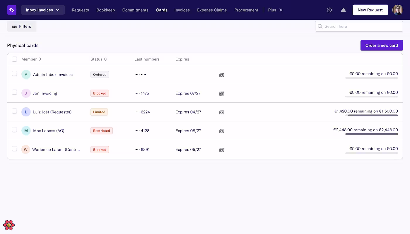 Spendesk in November 2024
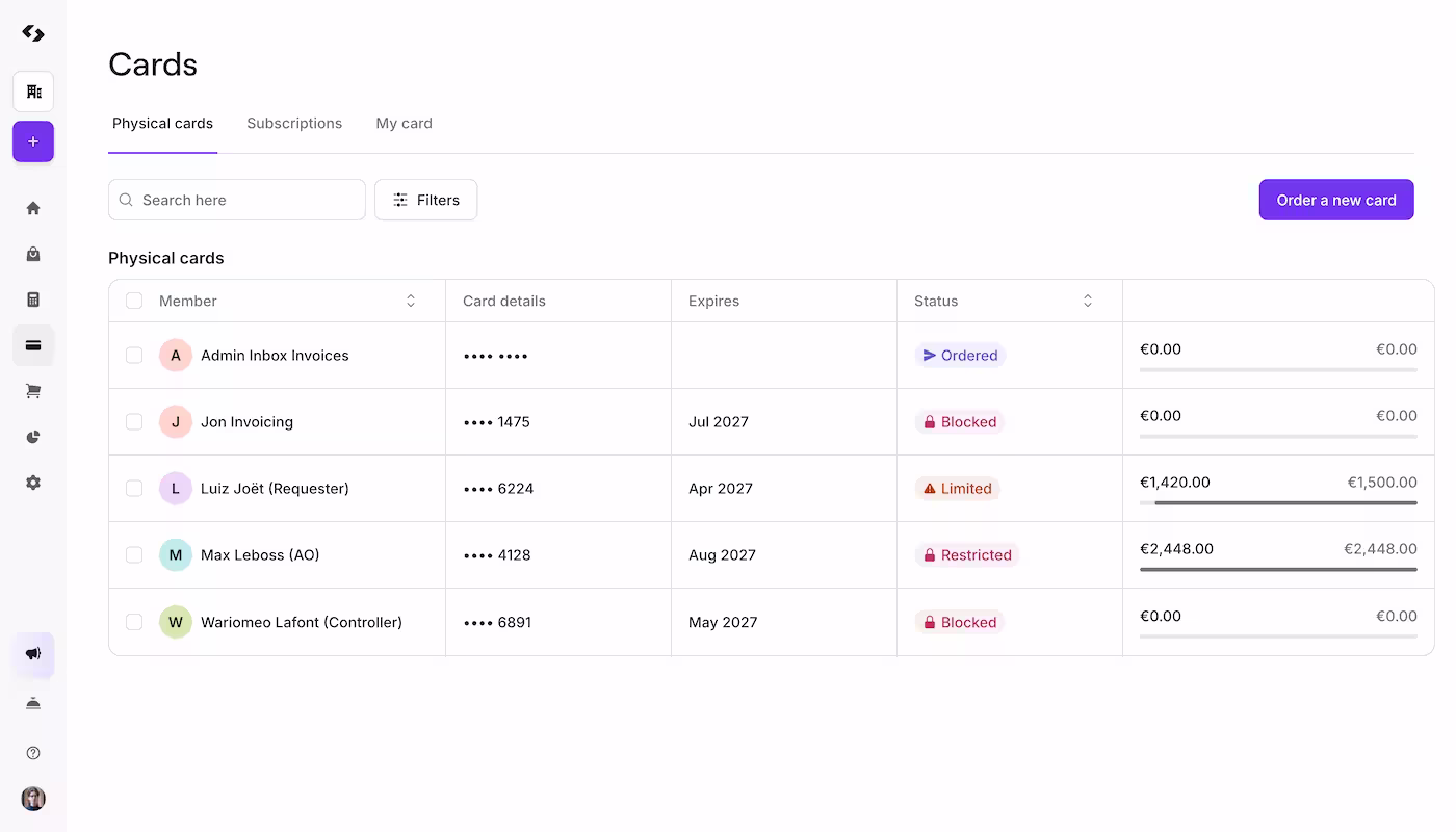 Spendesk in January 2025
The early days
History of the Design System at Spendesk
In 2020, the first commit of the design system was pushed. It was before I joined Spendesk. At that time, only one developer and one designer worked on it on their spare time.
In 2021, the ownership of the design system shifted with the departure of the developer. Instead of one owner, the design system became own by two people on the tech side. This is where my journey in the design system start as I become one of the owner of this project.
In 2022, the designer who worked on the design system left the company. Starting 5 long months of quiet for the design system. No evolution and no new component. Only bug fixes were allowed while waiting for the perfect designer to come around.
In 2023, the design system team was created, consisting of three full-time members, including myself and a brand new designer, and the idea of a full rebranding began to take shape.
Increase adoption
Ben Callahan describes the lifecycle of a design system in four steps:
- Stage 1: Building version one
- Stage 2: Growing adoption
- Stage 3: Surviving the teenage years
- Stage 4: Evolving a healthy program
Stage 1 was 2020 with the first version of the Design System. Since, we were in the growing adoption stage. Every new features or pages was build with the design system from 2021 and onwards. This approach helps maintaining a good adoption and increase the coverage of our design system within the main Spendesk product.
In 2022, we built a proof of concept (POC) to monitor the adoption of our design system, using a Looker dashboard to track its usage. To keep things simple, I developed a script that compared the number of imports in our codebase. The approach was straightforward: our old UI toolkit was stored in a legacy folder, while our design system was, and still is, named Grapes. By comparing the number of imports containing legacy versus those containing Grapes, we could get the relative usage of each.
Although this method is far from being perfect, our goal was to identify trends rather than have precise numbers. Two and a half years later, this is that this very simple script show us:
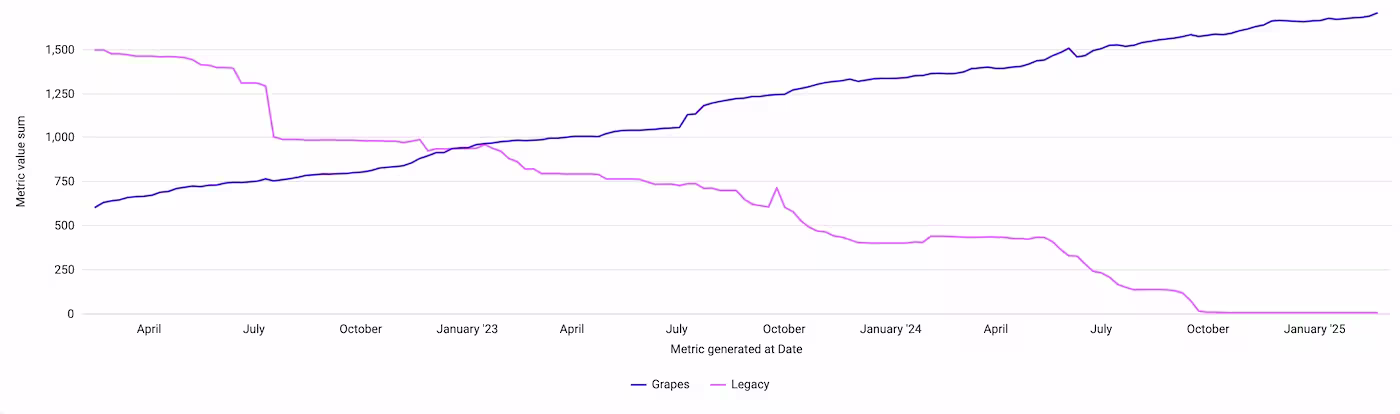 Our Looker dashboard
We reached 50% in January 2023 and 99.7% at end of 2024.
While the graph appears to show a clear trend, it hides a lot of complexity. Like many projects, our codebase contains legacy code, some dark room nobody opened for years. To achieve 100% coverage and successfully rebrand Spendesk, we had to revisit and open the door of these dark rooms again.
In our case, we identified a threshold at around 60-70% coverage, beyond which the remaining percentage would require diving into the legacy code. This is where the dedicated team came in, with the first mission being to tackle this legacy code and bring our coverage up to 100%.
Handling legacy code
I won’t sugarcoat it - securing time to work on the legacy code required a lot of political effort and skill. You have to convince everyone that investing in the oldest parts of your application would ultimately benefit the company.
Fortunately, we got the necessary resources and time to tackle this task, which was honestly the most difficult part.
Once we had the green light, the rest of the process was actually quite fun. We organized a series of sessions with all the squads to pair and migrate the legacy code in their scope to our design system. The objective of each session was to rebuild a page using our design system, a process we called “Grapesification” - a term invented by our designer in the design system squad.
When updating pages, we didn’t always have a new design to work from. In these cases our approach was to make a best-effort attempt to replicate the existing layout and behavior as closely as possible.
The sessions and their impact can easily been seen on the coverage graph.
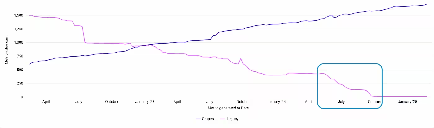 Zoom on a window where legacy decreased a lot
From May 2024 to September 2024, our primary focus was on migrating Spendesk’s legacy code and we were able to reach a coverage of 99.4%.
Once this milestone was reached, the work on the rebranding could start!
Rebranding Spendesk
Our approach to the rebranding involved a two-stages plan:
- Stage 1: Build a new version of the Design system and released it on the Spendesk frontend.
- Stage 2: Migrate the layout of the pages
As of today, we have finished both stages of our rebranding. In this article, we will explore the specifics of the first one.
Building a new version of the design system may seem straightforward, but the actual challenge lies in migrating the entire codebase of our main product from one version to another, especially when adding in the mix a huge number of architectural changes.
Design System refreshed
Freeze of the current version
Before any work on the new version, we announced a freeze on the current version of our design system. This meant that no new features, components, or design changes would be introduced, and only bug fixes would be allowed.
As our GitHub repository is configured with semantic-release, we created a maintenance branch tied to the specific version.
This setup allowed developers to continue contributing and releasing bug fixes for that version while we worked on the new version on the main branch.
Design tokens
The first step in this rebranding was a complete change in our design token architecture. Previously, a design token was a simple representation of a color, spacing, or typography size. These design tokens were then used throughout the Spendesk frontend and our design system components.
Here is an example of the design token exporter by the previous version of our design system:
:root {
  --color-primary-lightest: #f4effc;
  --color-primary-lighter: #dfd3f6;
  --color-primary-light: #7542d9;
  --color-primary: #5d21d2;
  --color-primary-dark: #4719a6;
}
The new version introduced the following architecture:
:root {
  --color-background-primary-default: var(--color-white-100);
  --color-background-primary-hover: var(--color-carbon-10);
  --color-background-primary-pressed: var(--color-carbon-15);
  --color-background-primary-selected: var(--color-purple-10);
  --color-background-primary-disabled: var(--color-carbon-5);

  --color-border-default: var(--color-carbon-15);
}
In the new version, the design tokens exposed are now linked to another set of design tokens called “primitives”.
This is a big change from the previous approach, where a single design token represented a specific color, spacing, or typography size.
Now, a single “primitive token”, such as carbon-15, can be used in different contexts, for example, for both the primary-hover and border-default design tokens.
This allows for more consistency and flexibility in how design tokens are applied throughout the system but that also add a lot of complexity for the migration.
Components
Once the base for our new design tokens was established, we starting to update our components. We introduced a lot of breaking changes.
At this point, we were already aware that migrating our design tokens would be a substantial task, so we deliberately chose not to impose any limits on the number of breaking changes for our components, allowing us to make the necessary updates without constraint.
Almost half our components contained breaking changes from the previous version.
 Our previous component called HighlightIcon
 Our new component called HighlightIcon includes more sizes and more variants
Migrate the frontend
One and a half months into the project, we began writing our first codemod for the migration. This marked the start of a long journey of trial and fail, or more politicaly speaking, an iterative process.
To be honest, it really didn’t work at first, until it did.
Try, fail, try again
Before we could start writing the actual migration code, we needed to create a map of the changes. We knew how to migrate the breaking changes in our components, but the color palette presented a more intricate challenge.
Our previous color palette had a specific naming convention, with variants ranging from darker to lightest, resulting in up to 7 different shades for each color.
:root {
  --color-neutral-lightest: #f5f5f6;
  --color-neutral-lighter: #e6e6e9;
  --color-neutral-light: #cfcfd5;
  --color-neutral: #b4b3bd;
  --color-neutral-dark: #706f81;
  --color-neutral-darker: #434159;
}
However, our new color palette had been simplified to only two variations: primary and secondary. After many attempts, we settled on a very naive algorithm to map our colors: any color with the dark or darker suffix would be assigned the primary color, while all other colors would be assigned the secondary color.
Example with the content grey scale:
| Previous Color | New color |
|---|---|
--color-neutral-lightest | --color-content-secondary-bg-secondary |
--color-neutral-lighter | --color-content-secondary-bg-secondary |
--color-neutral-light | --color-content-secondary-bg-secondary |
--color-neutral | --color-content-secondary-bg-secondary |
--color-neutral-dark | --color-content-primary |
--color-neutral-darker | --color-content-primary |
This mapping was just the beginning. Our new color palette including 3 colors family:
- Content: design tokens for text and icons
- Background: design tokens for background colors
- Border: design tokens for borders
To replace a design token, we had to consider its context. For example, --color-neutral-darker could be replaced with --color-content-primary, --color-border-default, or even --color-background-primary, depending on how it was used.
In certain cases, the context took precedence over the previous mapping. For instance, we only have one color variant for the hover state in the border family.
Considering this, our script had to transform --color-info-light into --color-border-hover within a :hover selector, rather than the expected --color-border-info.
.myClass:hover {
  border-color: var(--color-info-light);
  border-color: var(--color-border-hover);
}
Instead of:
.myClass:hover {
  border-color: var(--color-info-light);
  border-color: var(--color-border-info);
}
Ultimately, we ended up with a mapping 1:n, where a single design token could be replaced with multiple different tokens depending on the context in which it was used.
Here’s a sneak peek at the final mapping for our border colors:
const borderMap = {
  '--color-primary': {
    ':hover': '--color-border-hover',
    DEFAULT: 'transparent',
  },
  '--color-primary-dark': {
    ':hover': '--color-border-hover',
    DEFAULT: 'transparent',
  },

  '--color-neutral-lightest': {
    ':hover': '--color-border-hover',
    DEFAULT: '--color-border-default',
  },
  '--color-neutral-lighter': {
    ':hover': '--color-border-hover',
    DEFAULT: '--color-border-default',
  },
};
With the mapping and context done, we began writing our codemods.
We made some breaking changes in the past and, with them, we built some codemods. I also experimented with codemods at a large scale by renaming the main folder of the Spendesk frontend.
However, our expertise was primarily limited to modifying React code. We had never written a CSS codemod before.
Additionally, our design system ships a TailwindCSS preset (See article), which means that the changes to our design tokens name would also impact the utility classes name. A previous class name text-neutral-dark would need to become text-content-primary now.
This added an extra layer of complexity to the migration process, as we would need to write a script to update these classes accordingly.
We had many failures, but we persisted and tried again. A crucial breakthrough came when we discovered Shopify’s codemod for their design system called Polaris. Their code included CSS codemods that used Postcss and we drew inspiration from their approach for our own code.
Over the course of nearly a month, we ran our codemod on a newly created branch from the main frontend branch twice a week. The Spendesk CI would then generate a preview environment, which we would share with the design team for review.
A key lesson we learned was the importance of including the creation date in the branch name to ensure that everyone was testing the same environment. To achieve this, we named our branches in a format like refresh-19-12 or refresh-08-12, which helped us keep track of the different versions.
We didn’t automate this process due to the high number of bugs and the fact that our codemods were being continuously built and patched throughout the journey. Some code also required manual migration, which made automation less feasible.
However, the time it took to create a new preview environment, typically between 30 minutes to 1 hour, was acceptable to us.
Release and freeze!
The last two weeks of december are an annualy release freeze at Spendesk. Nothing get released for about 10 days to 2 weeks mainly because most engineers are away during this period.
We saw this as an opportunity. As soon as the release freeze began, we ran our codemod one last time to migrate the frontend, but this time, our pull request was made to be merged into the main branch.
Given the scope of the change, which impacted 90% of our CSS files and half of the JavaScript codebase, we had to work during a time when no one else was making changes to avoid having a billion conflicts. Although running the codemod only took 20 minutes, this brief window was still long enough for someone to create a PR, modify a few files, and introduce conflicts into our pull request.
 Preview of the Pull Request in Github highlighting 1936 files changes
So, we waited until everyone had finished their work for the day, and then we started our process. By the next morning, everyone would see a brand new version of Spendesk.
Time for pairing again
After introducing the new version of our design system internally at Spendesk, our journey was far from over. We still needed to ensure that everything worked and looked as intended for the first release of 2025.
Building on the success of our previous pair programming sessions during the adoption phase, we decided to repeat this approach. However, this time around, we faced a hard deadline and many frontend engineers were on holiday.
These pair programming sessions were crucial for several reasons:
- They allowed us to showcase the new version of our design system to our consummers: our “dear frontend friends”
- Get valuable feedback from them, including insights on naming, areas for improvement, and more
- Make sure everything worked as expect in the Spendesk frontend with the people building the product.
This window before the first release of 2025 also gave us the time to plan our approach to handling bugs. It was essential to establish a clear understanding and communication about the distinction between visual bugs and behavioral bugs. Without this clarity, there was a risk that every bug, regardless of its nature, would be directed to the design system squad, with comments like “The button doesn’t work” being misattributed to the design system team simply because it involves a “button”.
Release in production
On January 6 2025, 3 months after starting the project, we released the rebranded version of Spendesk into production. We were prepared for everything and anything, but the release went smoothly and no incidents were reported. In fact, this rebranding created 0 incidents.
Sure, we did receive some feedback from users who weren’t entirely happy with the changes. That was expected. However, what was unexpected was the extremely low volume of feedback we received: 6 feedbacks over more than 10k customers.
Conclusion
0 incidents, an impressive rate of less than 0.6% unhappy customers, and a timeframe of just three months, that’s how we can summarized this rebranding. The most ambitious project I have ever done and we were only 2 frontend engineers working on this. A great success!
However, as I mentioned earlier, this was just the first stage. The second stage involved changing the layout of many pages on our platform. This stage was going to be rolled out progressively, at a much slower pace.
So, the heavy lifting was done and we could finally sleep and celebrate (or celebrate and sleep).
I will finish this article by sharing a quote from my manager:
I was part of a company who had a Design System team of 10 engineers, and an overall engineering product team that was massive. They tried to achieve something like UI Refresh and never managed to achieve it (in fact they are still struggling with it today 3 years later). The Design System team here have moved absolute mountains with support from every squad to achieve a huge amount of change. Without the drive of Marie-Aline, the engineering brain power of Thibault & Pauline, and the support of product, design and engineering this would never have happened. Sorry for the long message but seriously the UI Refresh is a massive achievement and you should all be incredibly proud